Starting in late 2018, I have collaborated with the PR/Publications team to design yearly themes and produce a mix of print and web collateral in both standard and special themed branding. As the current Graphic Design and Publications Manager, I lead the charge on developing new media methods, such as pushing attention-grabbing motion graphics and reconfiguring our outlook on print materials in light of cost increases. This includes a complete overhaul of our program guide book and reestablishment of our brand identity.

Anime Boston Branding
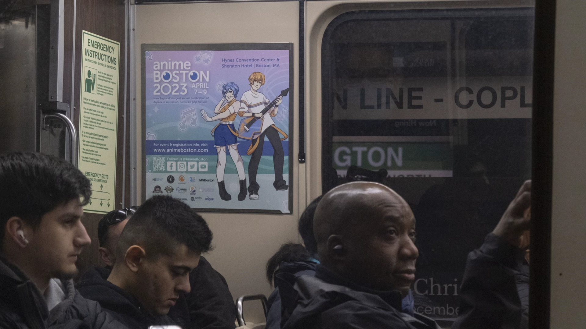
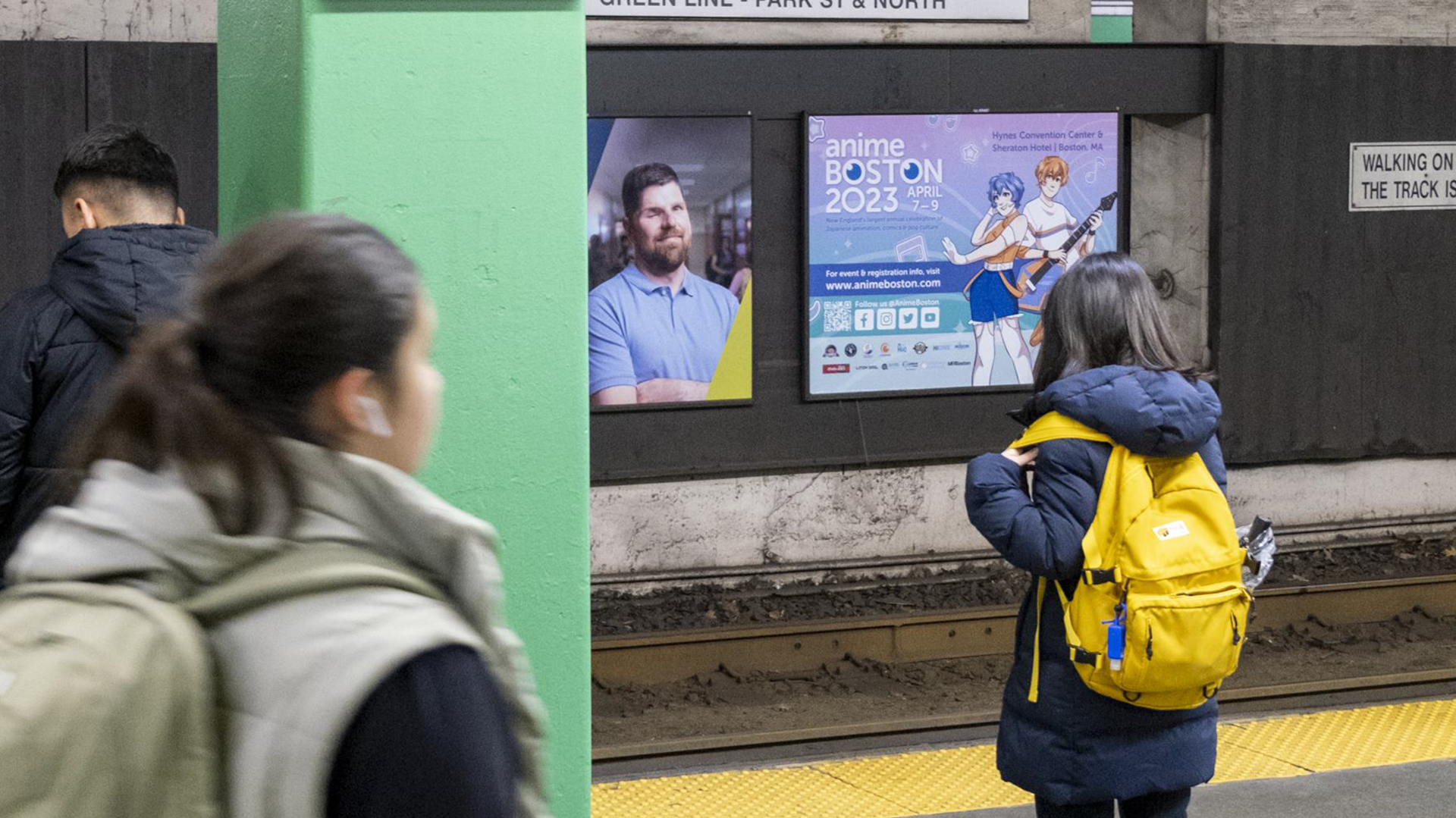
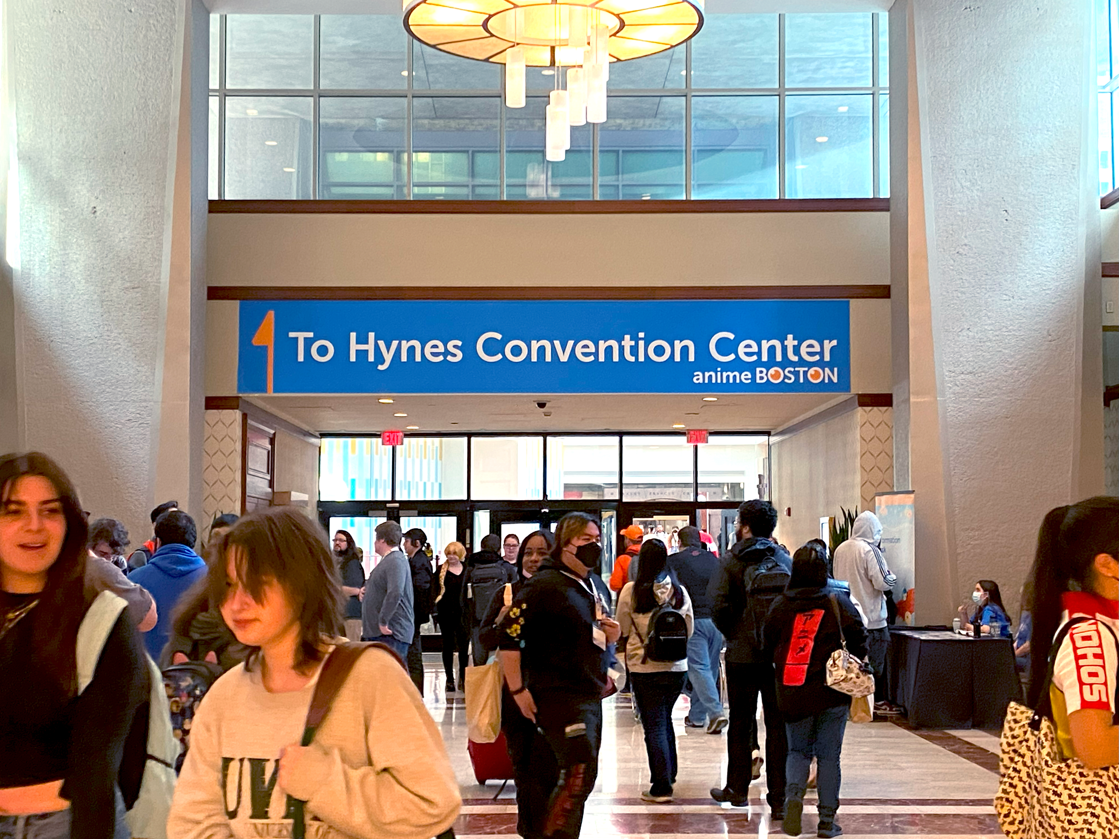
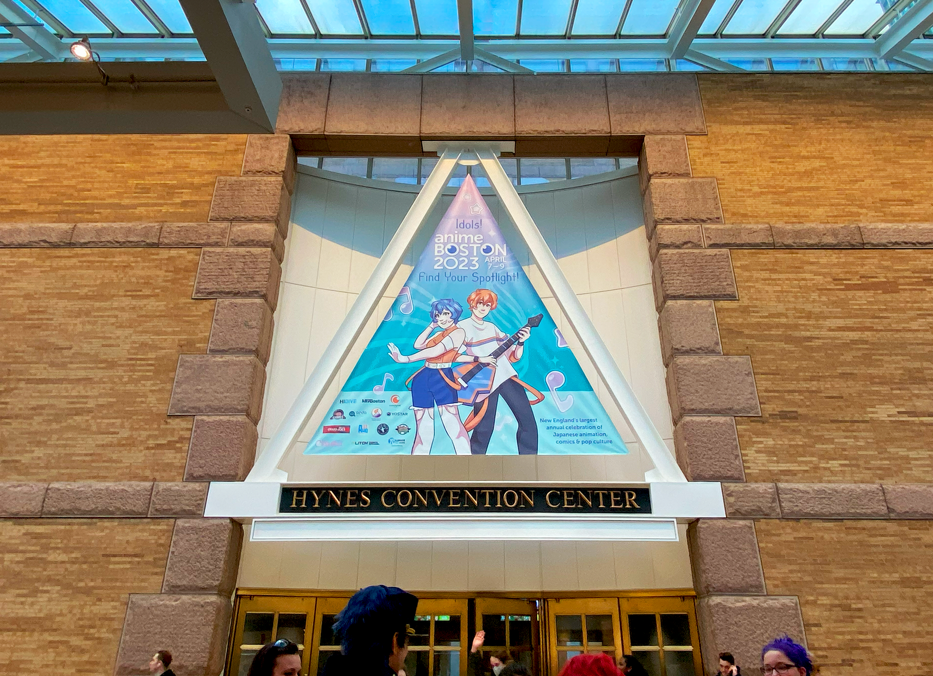
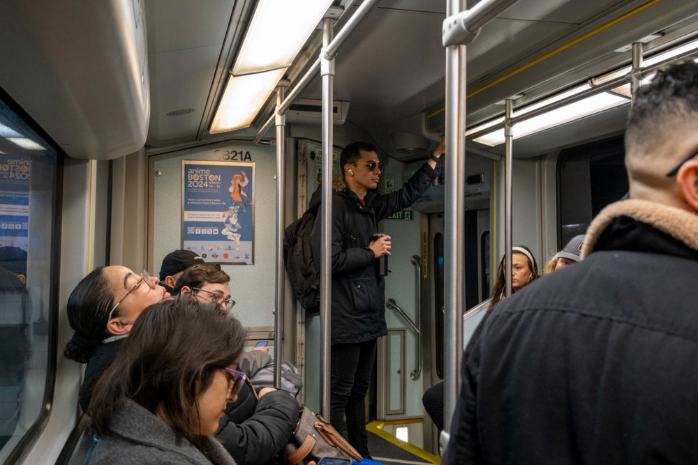
Anime Boston spent over a decade developing a new visual theme for each annual event - pop music idols, space exploration, monsters vs robots, and more. However, in light of increased printing costs and the heavy workload required, the organization decided to retire that tradition after their 2023 event. This left us with very few generic graphics available to use on signage, social media, and panel visuals, so I led the charge on reframing how they treated their visual identity.
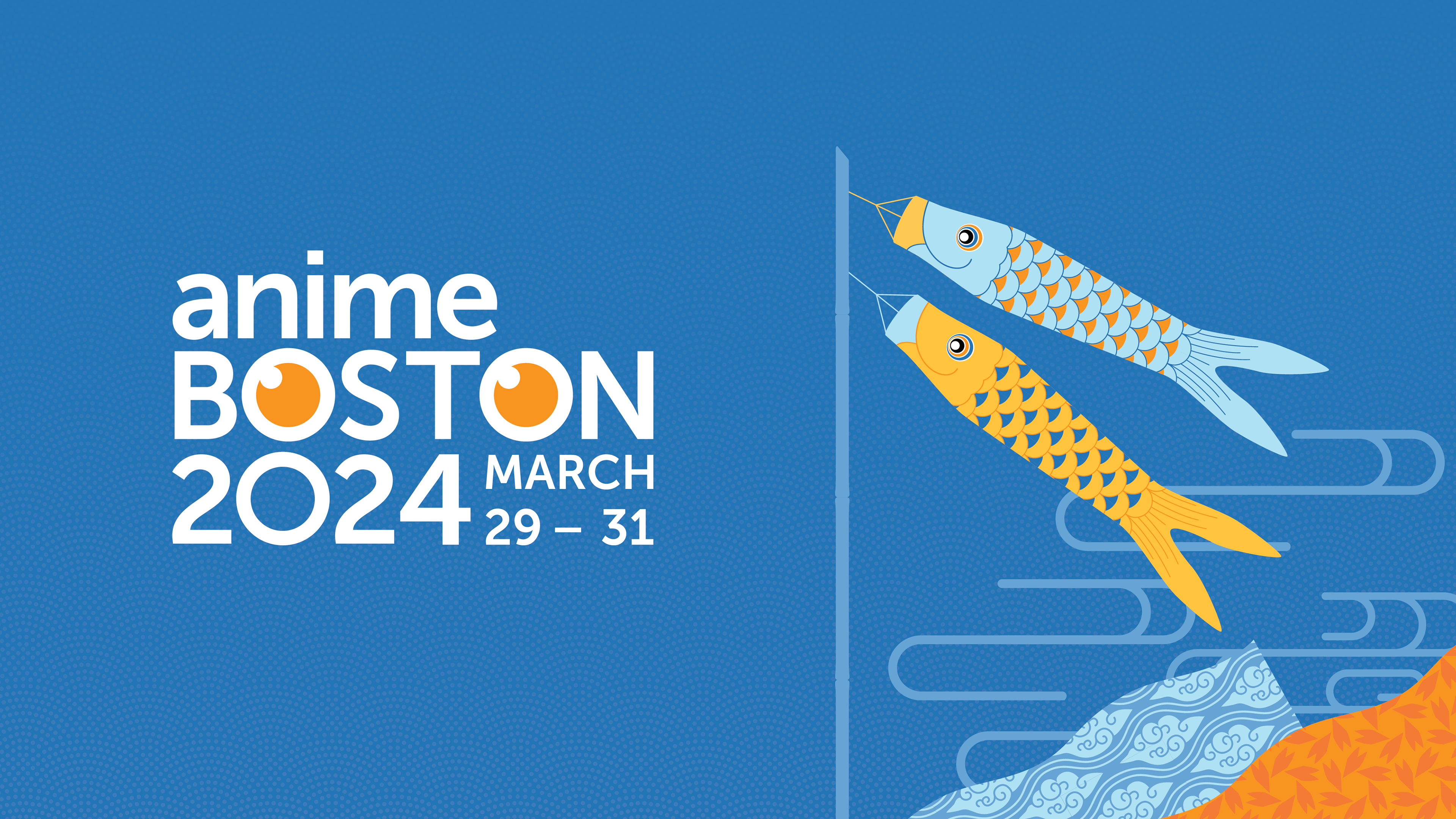
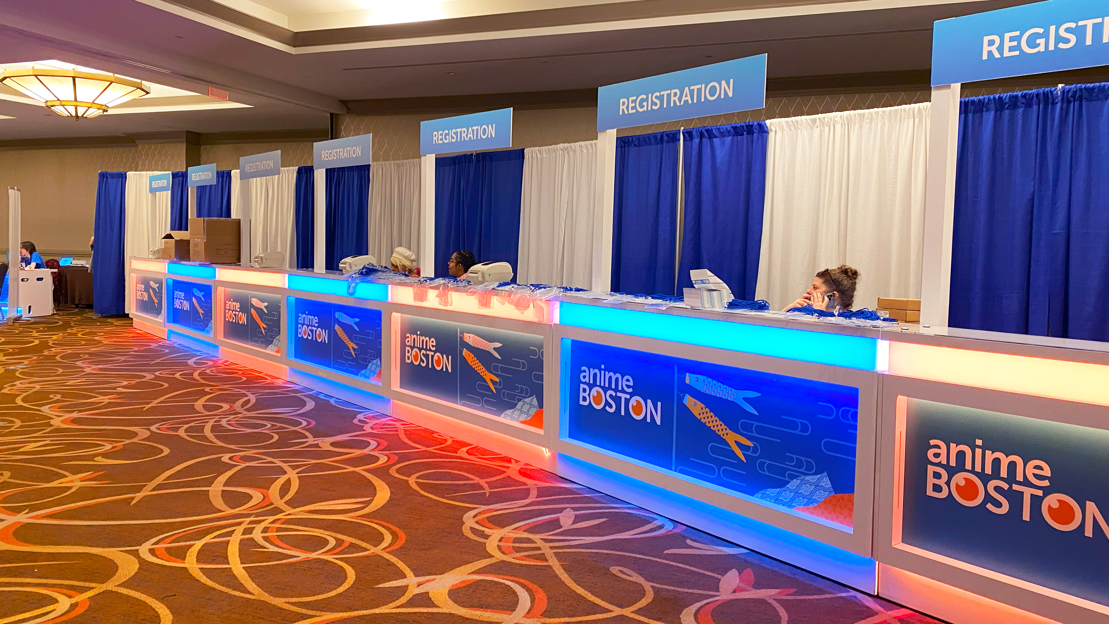
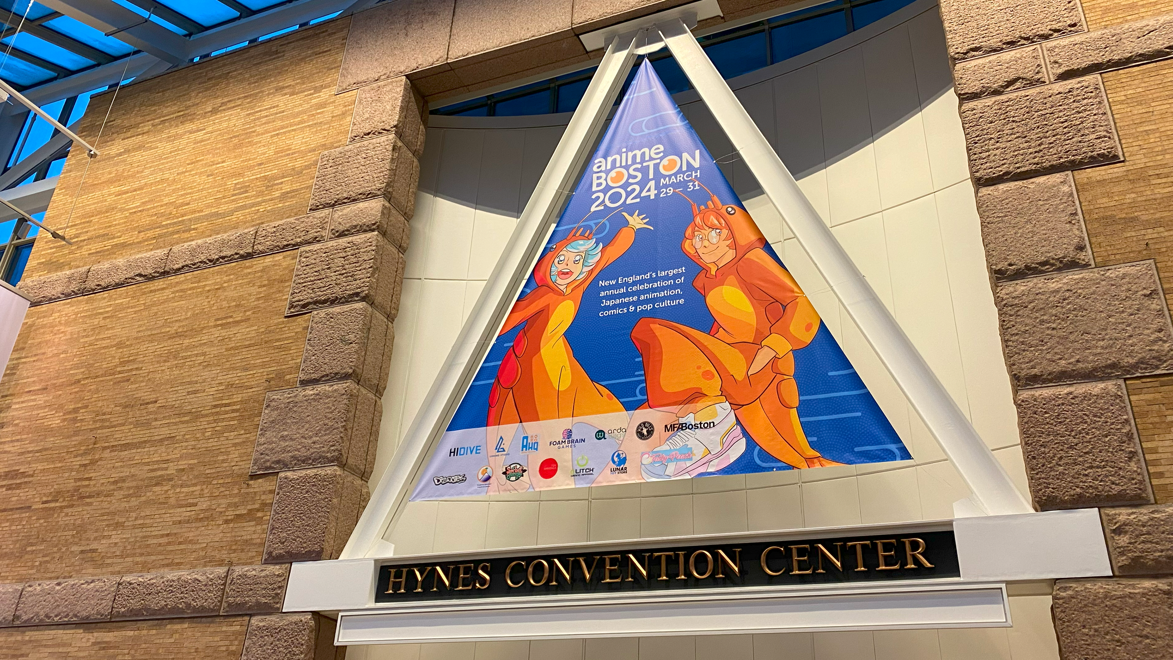
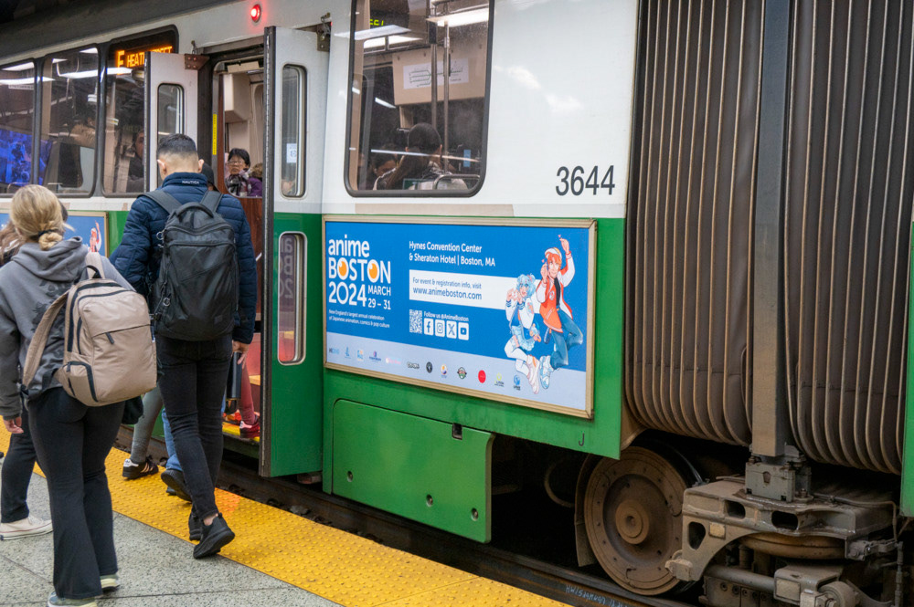
The primary drive involved developing new graphics true to Anime Boston's values that could be reused and expanded on for the foreseeable future. Anime Boston's last generic graphics were developed around 2012, so the visual style was outdated, and the design was not emphasizing our official colors. However, the repeated leaf pattern used as accents had been carried over into more recent graphics and remained popular. With that in mind, I developed a plan that emphasized pattern usage and complimented our location. Boston is a maritime and often windy location, so I identified koinobori - traditional Japanese fish wind socks - as a starting point, then emphasized other Japanese historical patterns in the background and supporting accents: same komon (shark skin) and kumo tatewaku (rising stream, cloud variation). As a Japanese pop culture convention, it is important to use iconography that is easily recognizable as Japanese while remaining both respectful and distinct. To expand the graphic options past the koinobori, I utilized an icon of Boston, the lobster, and an icon of Boston's sister city, Kyoto, Tō-ji Temple. All of these graphics together allowed for attractive designs, variety, and flexibility in use across our social media, website, projected panel graphics, program guide book, and signage.