
DragCon UK x Crocs - Main Stage Sponsorship
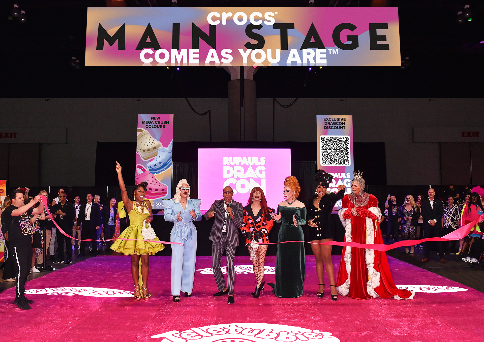
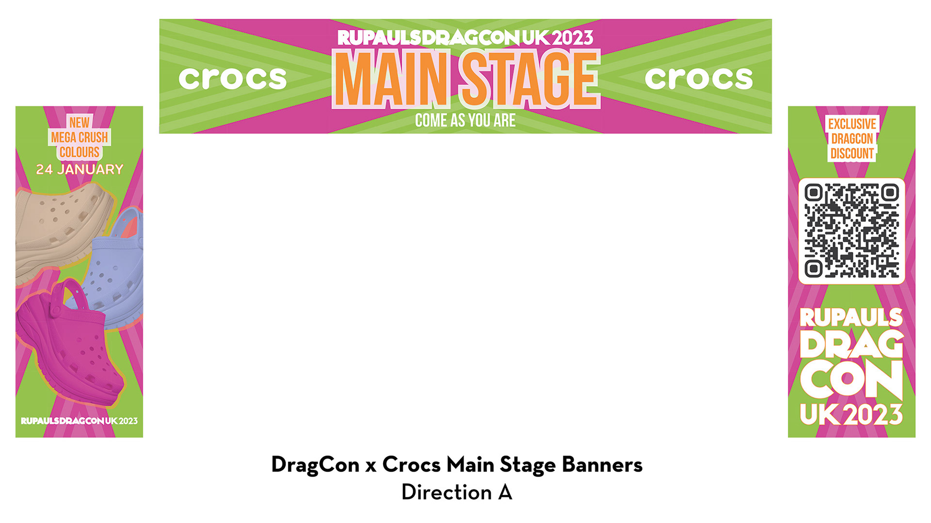
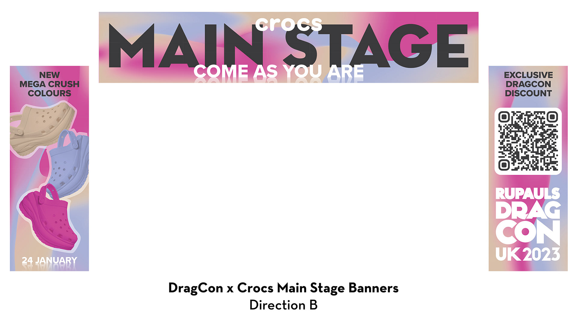
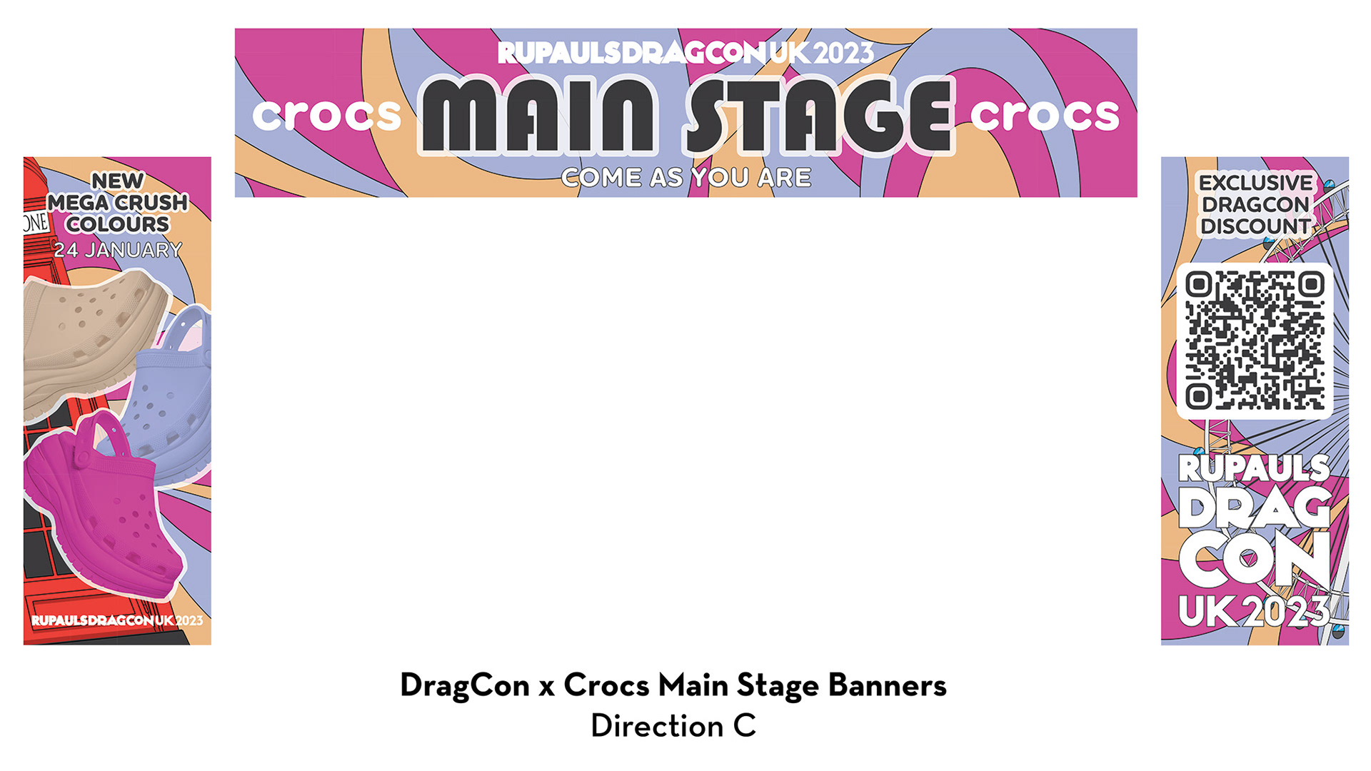

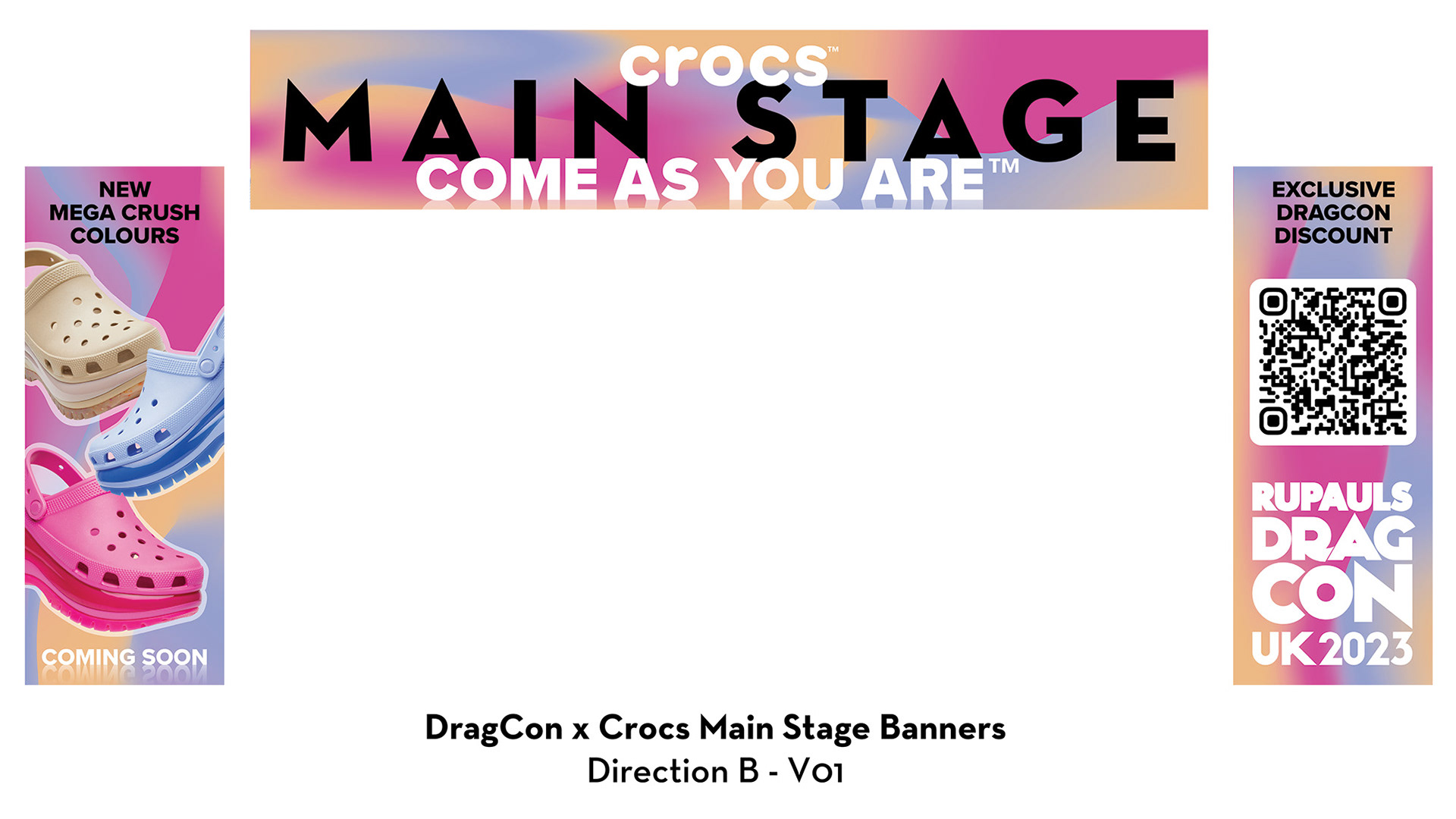
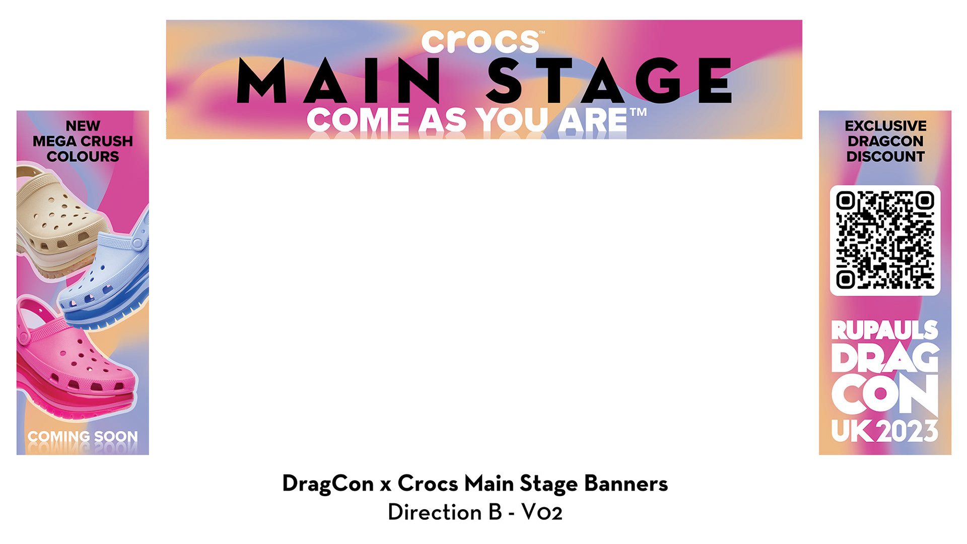
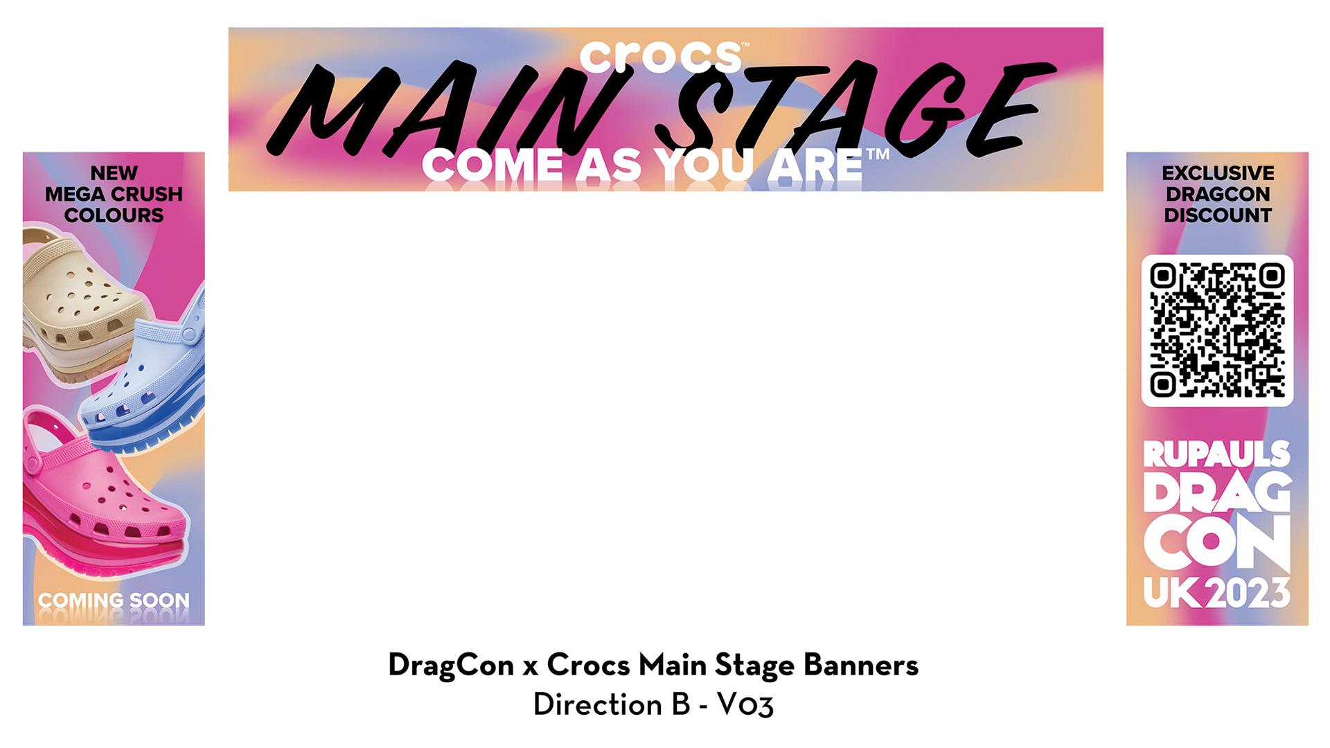
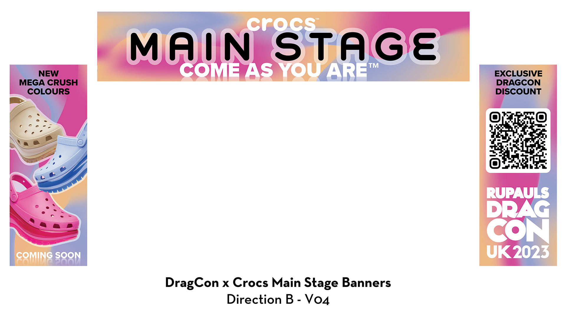
This collaboration posed a unique challenge of balancing Crocs' and DragCons's somewhat oppositional branding. While some of Crocs' promotional materials for the Mega Crush line feature bright, playful, cartoonish graphics, they were made to compliment the bold black and white options initially available. With the new colors included in the promotion, the final design came down to using more saturated versions of the new Pantones in order to compliment and uplift the product promotion, rather than overpowering it. In addition, the project posed the challenge of incorporating the requirements and requests of multiple departments in each company, which had up to a 9 hour time zone difference and partial language barrier. For instance, management at DragCon wanted to use the "Come As You Are" tagline from the beginning as a reference to the inclusivity of drag. However, including "Crocs," "Come As You Are," and "Main Stage" on the hero banner (which already had a size locked in) required many stages of experimentation to have all three be readable and not leave a significant amount of dead space.
DragCon LA 2022 Badges
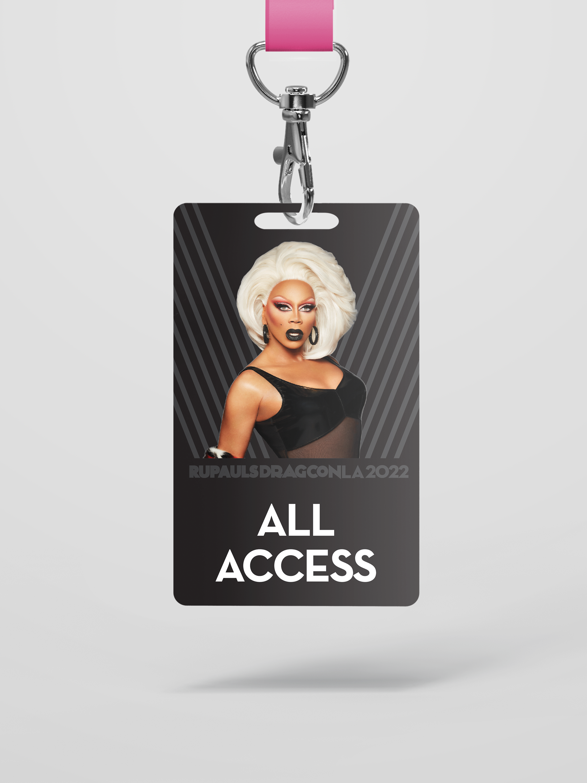
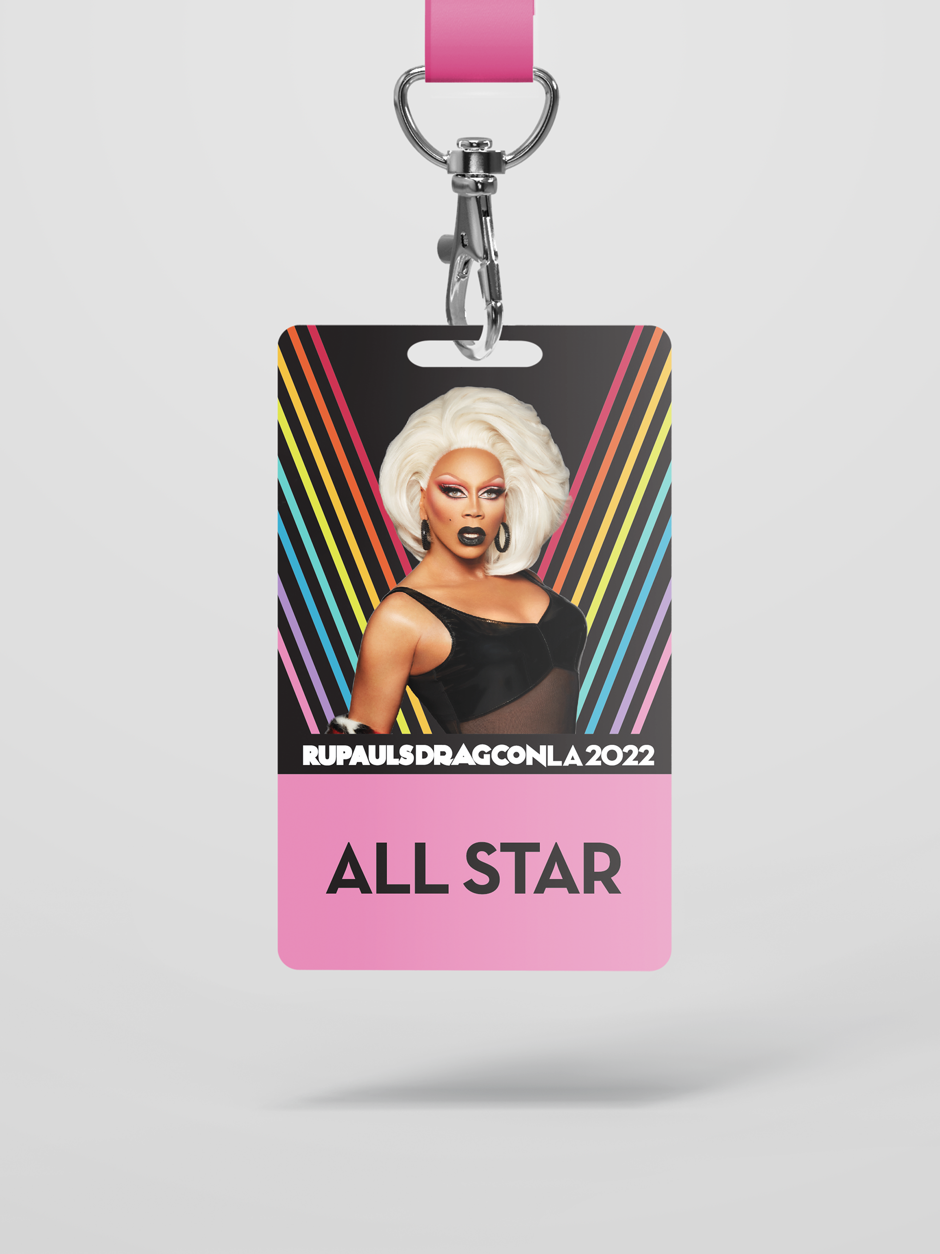
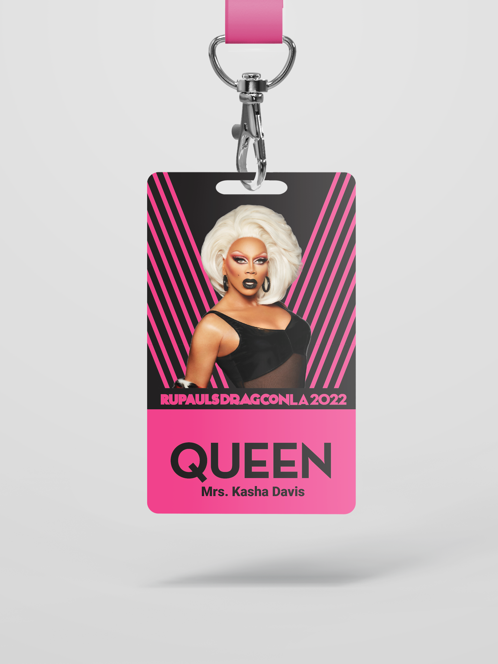
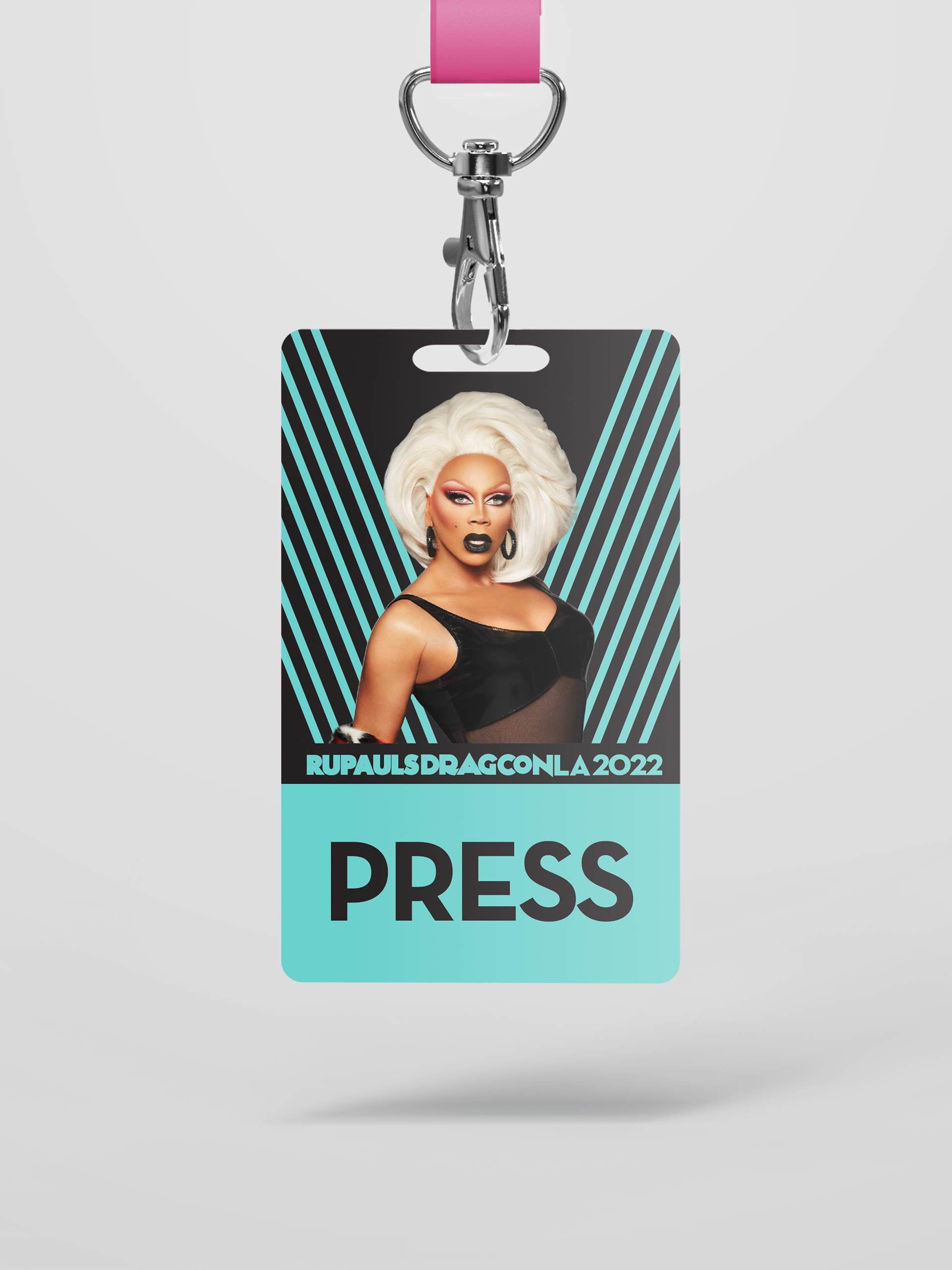
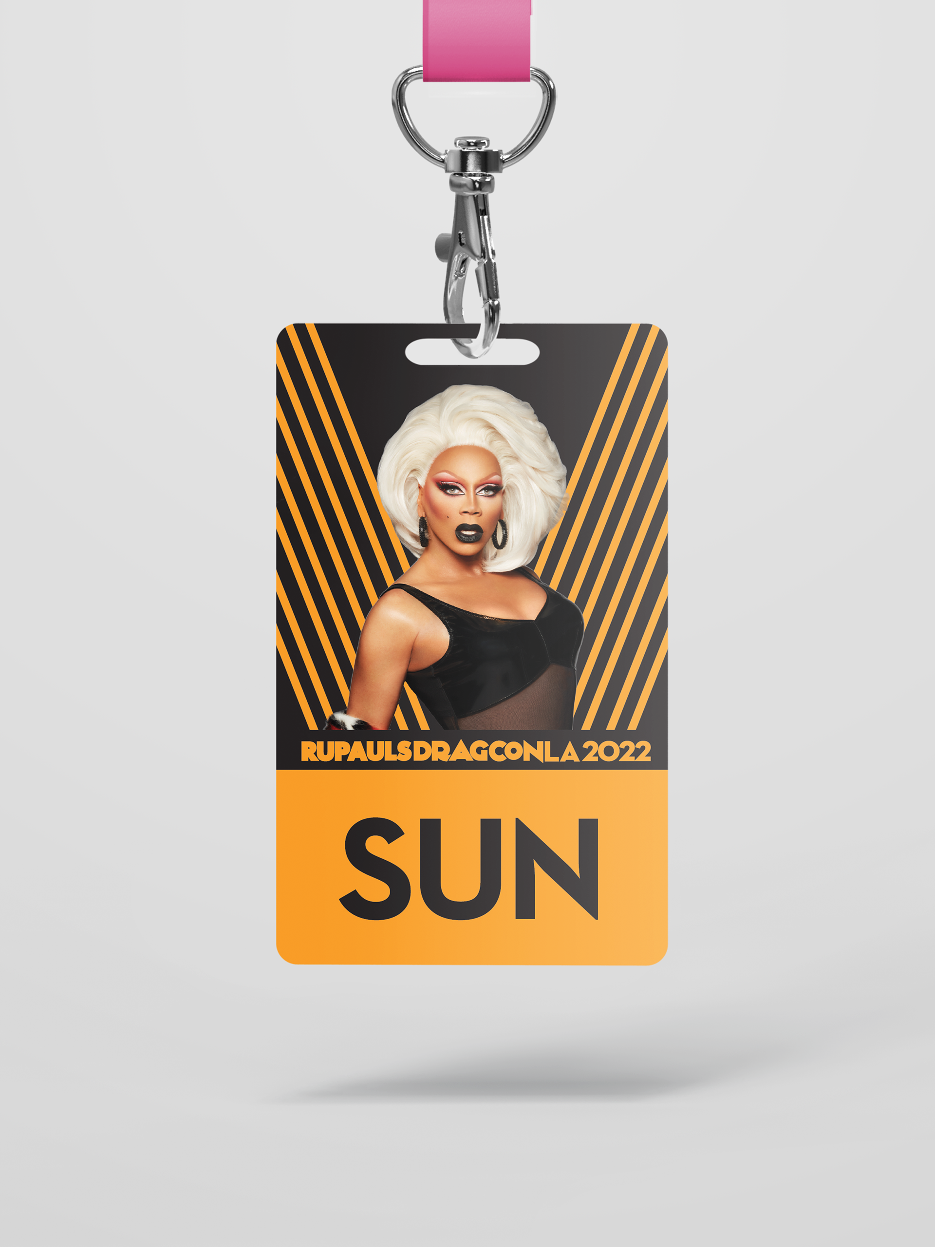
When I joined the DragCon team, badges were already a few stages along in development, but my predecessor didn't leave behind any working files. So, in addition to recreating and improving the photo masking and graphics, I was tasked with implementing all of the team and management notes on a short deadline. Badges like All Access had to be easily distinguished so security could quickly spot who was allowed to be in sensitive areas, and badges like All Star needed to make the wearer feel special, since they paid for a VIP experience. The team also requested that Queen badges include the wearer's name on the front for easy identification. With over 120 queens invited, it would have taken a consequential amount of work to accomplish manually, especially if font changes needed to be made later. So, I implemented a Microsoft Publisher system that could take information from a spreadsheet and automatically export every name. Since font sizes and positioning were indeed changed a few times before printing, this cut out a significant amount of time.
Drag Race France Badge
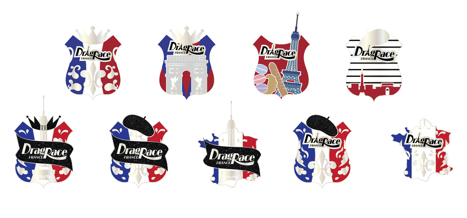
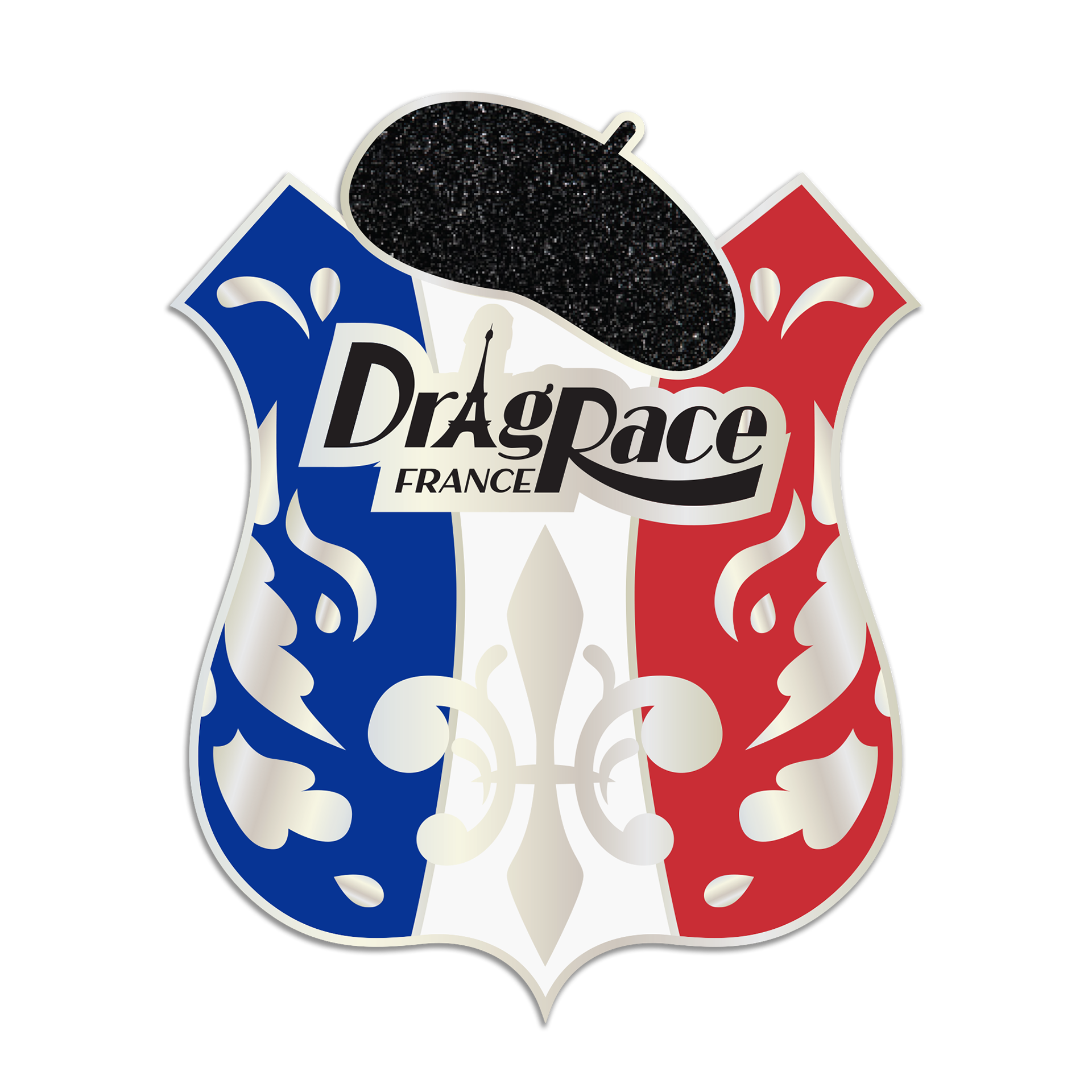
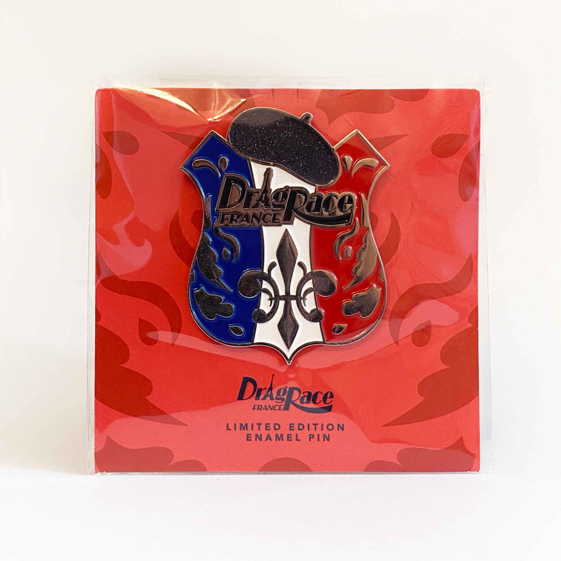
The Drag Race franchise has, since approximately 2019, been producing "RuPeter" badges for every international season of the show. Many are based on badges that appear in-show, but Drag Race France was a new segment of the franchise with no show versions to base it on. My goal was to explore unexpected but recognizable icons of French culture, such as food, mimes and landmarks other than the Eiffel Tower. In the end, our preferred design featured the fleur de lis and a brocade pattern front and center, which complimented the fashion-forward nature of the season.
Anime Boston - New Graphic Push
For Anime Boston 2022, we had more time than ever to edit and finalize graphics. Most of them had been completed for the cancelled 2020 convention and only needed minor touchups, so I took the opportunity to introduce simple, snappy themed animations to the digital display screens in the convention hallways. Typically, attendees and staff only pay attention to the information when they are looking for something, but we got a significant amount of compliments in the feedback survey about this masking clip catching their attention. The direct language but playful tone made Anime Boston's policies clear while maintaining a friendly, lighthearted tone. After this project, I was promoted to the position of Graphics & Publications Manager. Considering printing and storage costs are higher than ever, I'm currently heading multiple digital graphics and animation projects to keep our yearly theming alive and well outside of physical props and banners.
General Reel